
REGEN 2024: BRANDING & MARKETING
PROJECT DATE: March-August 2024
PROJECT DURATION: 6 Months
ADDITIONAL CREDITS:
Director - Will Savage
Head Of Production - Cara
Social Media Manager - Sam
SOFTWARE USED:
Blender (3D)
After Effects (Motion Graphics, Animation)
Final Cut Pro X (Video Editing)
Photoshop (Graphic Design)
CLIENT: Team Regen
ROLES: Creative Director, Marketing Director, Lead of Graphics & Video, Concepting
Regen 2024 was a live, in-person gaming event held by ‘Team Regen’ and took place from August 23rd-25th in Leicester, England.
The event garnered 720+ attendees, making it the biggest Super Smash Bros tournament in UK history.
In order to set this new record, we (Team Regen) chose to increase the production’s scale across the board compared to previous years’ events. We chose to hold the event in The Athena, in Leicester, which holds shows such as The X-Factor - it was originally built as one of England’s earliest cinemas, in 1938. The marketing campaign was resultantly themed around film, in part due The Athena’s historical value.
To truly elevate the event’s potential, I began working full time for Team Regen and personally designed Regen 2024’s entire marketing campaign, (re)branding and every single creative asset for the event.
Regen 2024’s marketing campaign saw a 466% increase in likes and 1200% increase in retweets over Regen 2023’s.
Merchandise created for the marketing campaign amassed £1500 in profit during the event and a further £1800 profit after the event.
Online viewership totalled 1.85 million minutes, up 168% from Regen 2023 to Regen 2024. In person attendance increased by 43%


BOLDER BRANDING
Just before Regen 2024’s debut trailer released in April 2024, Team Regen’s graphic designer at the time chose to leave the team due to personal reasons unrelated to Team Regen Ltd.
Beforehand, he had created a design brief to fit with my proposed film branding for Regen 2024. This design brief utilised a red/purple/blue gradient, noise overlays and featured miscellaneous film related assets. In taking up the role as lead (and sole) graphic designer upon all my other responsibilities for Regen 2024, I decided to revisit and alter the event’s design brief.


Original branding and Design Brief for Regen 2024


Note:
A limited number of infographics/promotional designs that utilised the original design brief and previous graphic designer’s templates were used before the revised design brief had been created and implemented.
The revised design brief was in effect for roughly four months of Regen 2024’s five month marketing campaign. While risky to change a substantial part of the event’s visual identity during the beginning of its marketing campaign, all members of Team Regen believed in and recognised the long term potential and short term effectiveness of the redesign.
Revisited branding and Design Brief for Regen 2024
Sleek readability was my greatest priority in this redesign, leading to my choice to give Regen 2024 a bolder look overall.
I replaced desaturated gradients with high contrast matte colours, rounded edges became sharp corners and the main font was additionally changed from Cureto to DDT (with -6% tracking and usually a +16 slant).
Due to the large number of creative roles I had to fill, I approached the redesign with workflow efficiency as an additional priority. Spending too much time on any one design would bottleneck both the marketing campaign and livestream pre-production, leading me to simplify the branding only to what was most effective stylistically and economic to work with. For these reasons, I removed additional clip art assets (such as cameras & noise overlays) that I believed didn’t elevate the event’s branding.
Another intention of the redesign was to homogenise aspects of the Regen series’ branding with Team Regen’s branding. In recognising that Regen is both the team’s and the UK Smash Bros community’s yearly flagship event displayed globally to tens of thousands of viewers, it was my belief that stylistic alignment would improve Team Regen’s brand recognition.


Above: Original Gameplay Overlay following original branding (left) vs Gameplay Overlay following revisited branding (right).
I believed that the original palette for Regen 2024, in conjunction with the emphasis on bevelled edges, wasn’t striking enough for use in an intense, competitive environment.
The use of cream as a primary colour for information made the colours appear ‘soft’ subconsciously, especially against light grays and desaturated reds. This is further exacerbated through the use of rounded corners, which naturally promote an idea of ‘safety’ due to their lack of sharpness. When this ‘soft’ style is overlayed above Super Smash Bros’ frenetic and volatile gameplay, a visual dissonance is created.
It was for this reason that I changed the cream to white, made the reds ‘redder’ and grays darker, creating a classic and simplistic high contrast look that would command audiences’ attention towards presented information. This was paired with my choice to make all edges sharp, creating a better visual cohesion between presented information and the fictional danger Smash Bros’ gameplay presents. Additionally, this new styling was also visually congruous with the design of Super Smash Bros Ultimate’s informational ‘Heads Up Display’ (HUD), which is similarly minimalistic yet efficient in colour and shape.
I also introduced a distinct seafoam green as a secondary colour to Regen’s branding palette.
This addition would allow us to use it both as an extended motif that signified secondary information to audiences and as small stylistic punctuation that’d improve designs.


Above: Miscellaneous designs made for Regen 2024 using the new branding
In removing unnecessary details and putting a greater emphasis on shape, contrast and informational hierarchy, I believed Regen 2024’s designs and branding would be perceived as sleek and eye catching, creating a further sense of prestige for the event.
All in all, the revised branding was very well received both during Regen 2024’s marketing campaign and as the event took place. The branding has already been taken forward for future Team Regen events.
THEMING + MARKETING CONCEPT
In deciding the theming for Regen 2024, when only the venue and date had been confirmed, I suggested to the team that we theme the event around movies, with a focus on parodying film posters, considering The Athena’s history as one of the earliest UK cinemas.

Above: Earliest proof of concept to display how parodying a famous film poster (right) is both feasible and likely entertaining for Regen 2024’s target audience.
Famous film posters are widely recognised, and if recreated with a strong execution could start discussions that increase brand awareness (“Did you see that Smash Bros ‘Jaws’ poster?”).
Film posters have incredibly diverse designs, allowing for a wide range of styles to fit and represent all of Super Smash Bros Ultimate’s 89 characters, which all hail from existing videogames of different genres and art styles. Events almost never feature more than a fraction of the cast in stylised promotions, meaning only the few players who play depicted characters will usually feel represented.
Important attendees that Team Regen want to advertise can be announced through a film poster parody, chosen and designed around the character they play. Famous players can be featured on parodies of universally loved films/poster designs to maximise shares and awareness for the marketing campaign.
Recreating and parodying existing designs reduces the time spent conceptualising new compositions, allowing for far more promotional pieces to be produced for the event.
As each promotional poster parody is posted to social media, anticipation and momentum for future posters would improve as audiences would be curious to see what design(s) would be revealed next and/or would hope that their favourite film is referenced.
It would be a unique styling for an event on a scale never seen before in the global history of Smash Bros tournaments. A few events had based their theming off individual films / film series before, but none had attempted to cover the overarching concept of cinema.
When the live event finally takes place, the most popular film poster recreations could be given away with/sold as merchandise. This saves production time by having a single design be multifunctional as both advertisement and merchandise. This also skips the need for focus groups in deciding which posters to sell as merchandise as Team Regen could look at engagement/likes/reposts on social media to find which were most popular.
This suggestion was made as a film theming would provide a large list of benefits besides simply referencing the venue’s history:
The event’s theme was revealed in April 2024, through Regen 2024’s debut trailer at Team Regen’s Invasion, to huge acclaim both in-person and online.
The trailer saw an increase of over 300% in likes and shares from Regen 2023’s trailer, reaching upwards of 1,500 likes and 700 retweets on Twitter. An additional version of the trailer, which displayed references’ origins as they occurred, was posted shortly afterwards and received a further 1,000 likes and 300 retweets.
The gigantic response to the trailer would result in a confirmation of the event’s theming and an expanded potential scope for the promotional campaign.
MARKETING CAMPAIGN
As mentioned in ‘Theming + Marketing Concept’, Regen 2024’s debut trailer was extraordinarily well received by audiences, outperforming our previous best performing piece of promotional media by a factor of three; it became one of the most liked Super Smash Bros tournament trailers ever.
To carry this record-breaking momentum forward, I decided to expand the original scope of Regen 2024’s marketing campaign along both traditional and experimental means that would all prove successful.
The Regen Posters
As originally planned, famous/important players’ attendance and miscellaneous announcements would be advertised through unique parodies of film posters. These were recreated entirely from scratch and each design was chosen to best fit the character a featured player would most commonly use.
Chosen designs were often referential to similarities shared between the featured Super Smash Bros character and the film depicted on the original poster; decisions were usually based on a balance of physical likeness and functional/narrative similarities. Additionally, referential humour was used in designs when possible to embellish them with a comedic value that audiences were even more receptive towards.
I worked closely with Team Regen’s social media manager to organise the schedule that film poster parodies were both created and posted. This also included establishing the most effective frequency of poster releases across the marketing campaign’s duration while evaluating the most beneficial order to advertise them in.
Individual film poster parodies would often be posted to social medias once or twice each week dependant on the schedule. Each post would receive between 120-600 likes and 20-100 retweets on Team Regen’s Twitter account; as predicted, the most well known films, poster designs & players would result in a post being more successful.
During the event, we were able to frame many of the designs on the venue’s inside and outside walls alike classic cinemas, creating a grand atmosphere and final realisation of the film parody theming which was incredibly positively received by attendees.
6 of the most popular parodies were able to physically received at Regen 2024, with the purchase of any piece of regular merchandise; designs’ text were lightly altered to remove mention of specific players. All parodies were later made available for purchase online with global shipping for a limited time and have since been available for purchase at later Team Regen events, with a different selection of the 72 designs offered each time.


Above: Select designs posted to social media to announce important players’ upcoming attendance of Regen 2024.
Click here to see all 72 film posters recreated for Regen 2024.
Early Bird Plus
Following the success of Regen 2024’s debut trailer and previous to the event’s registration going live, I speculated that many attendees would be desperate to be featured on a poster parody if they had the chance; personalised designs for attendants are usually only reserved for important/famous event-goers due to their economic benefit.
After discussions with Team Regen’s director, I devised a method to provide 100 attendees the ability to be featured on their own personalised film poster parodies that would simultaneously improve Regen 2024’s profit margins, brand loyalty and the reach/awareness/scope for Regen 2024’s marketing campaign. This idea would become the immensely successful ‘Early Bird Plus’ registration tickets.
‘Early Bird Plus’ registration tickets for Regen 2024 cost £80 (£20 more than a regular ‘Early Bird’ ticket) and were limited to the first 100 purchasers of the ticket type. The ticket’s appeal was that it’d allow the attendee to have their favourite Super Smash Bros character and gamertag featured on a random unique film poster parody alongside other ‘Early Bird Plus’ attendees, in groups ranging from 3-8 (dependant on the poster’s design).
To further entice attendees, it was stated that they would also receive their poster digitally, once theirs is posted online during the promotional campaign, and physically, when attending Regen 2024 in person.
Early Bird Plus sold out in 8 minutes upon registration going live.


Above: Two sample posters included in the announcement of ‘Early Bird Plus’ a few days before event registration went live. No individual film poster parodies had been released yet so I sought to display what audiences could expect from each poster.
100 attendees paying an extra £20 for entry resulted in an additional £2000 revenue, with poster printing costs only removing £160 from the total.
Personally involves 100 unique people in Regen 2024’s marketing campaign, drastically increasing the likelihood of them and their friends sharing the design they’re featured in. Additionally may result in improved word of mouth advertising.
Being provided a unique, personalised design, even if it’s been paid for, would create a strong amount of brand loyalty to Team Regen compared to other live-event production teams, which don’t offer the same level of individual treatment.
High standards of quality for each design promote a prestigious image for Team Regen. Audiences may be lead to sign up for Regen 2024, assured of its production quality from consistency of its promotional works. Additionally, entrants who may have skipped Regen 2024’s ‘Early Bird Plus’ due to doubts of its value may become more loyal and trusting to the brand; entrants may even anticipate following events as not to miss out on something similar to an ‘Early Bird Plus’ parody poster again.
‘Early Bird Plus’ allowed for the creation of 22 more designs. This both lead to the marketing campaign attaining an improved consistency of advertisements across a longer duration. The improvement in design quantity would also later result in the ability to sell a greater range of merchandise both online and at future Team Regen events.
‘Early Bird Plus’ provided a considerable list of marketing and financial benefits that lead me to the decision to follow through with the concept:

Above: An ‘Early Bird Plus’ Poster with players’ gamertags replaced by character names
The Regen Raffle
During Regen 2024’s marketing campaign, I saw many social media users comment that they were sad they wouldn’t get a poster or that they missed out on purchasing an ‘Early Bird Plus’ ticket. In reaching out and talking to a few of these people, including both people who had and hadn’t registered for Regen 2024, I recognised that holding a raffle could improve Regen’s advertising outreach and revenue (through additional registrations) while providing new and old attendees the chance to receive on their own unique design.
In discussing with Team Regen’s director and Social Media Manager, we decided the terms of the raffle should be that:
To be eligible to enter, you must be registered for Regen 2024 by 6/7/2024 (1 week time limit).
To enter, you must like and retweet the raffle’s announcement video.


Above: Frames taken from Regen 2024’s raffle announcement video.
The raffle was ultimately a strong success for Team Regen, attaining over 130 people entering and 22 new sign ups for the event; during the week that the raffle was active, Regen 2024’s rate of registration improved by nearly 320%, falling back to a regular rate towards the end of the 6th day.
The five raffle winners all received their designs; all winners in attendance at Regen 2024 personally thanked members of the team for holding the raffle, having never before received a personalised design alike what was provided.
Click here for more details on the raffle announcment video
Miscellaneous Marketing / Promotional Work
While the main focal point of Regen 2024’s marketing campaign was its film poster parodies, additional promotional works were created the further entice potential attendees, highlight personalities and provide additional information.

PHYSICAL PROMOTIONAL POSTER
An advertisement for Regen 2024 made for print. The promotion was placed around Leicester in public spaces such as pubs and cafes in advance of the event.
I chose to emphasise the event’s primary identity as a party/festival, rather than a tournament, to increase the likelihood of attracting casual gaming fans, which are far more common than hardcore & competitive gaming fans.
I reutilised my 3D render of the Smash Bros characters partying from my recreation of Another Round’s (2020) poster in this promotion. Due to it presenting an elated atmosphere featuring a wide cast of iconic gaming characters, it allowed audiences who may not be familiar with either cinema or Super Smash Bros to understand Regen 2024’s main premise.
TRAVEL GUIDES / INFORMATION FOR FOREIGN AUDIENCES
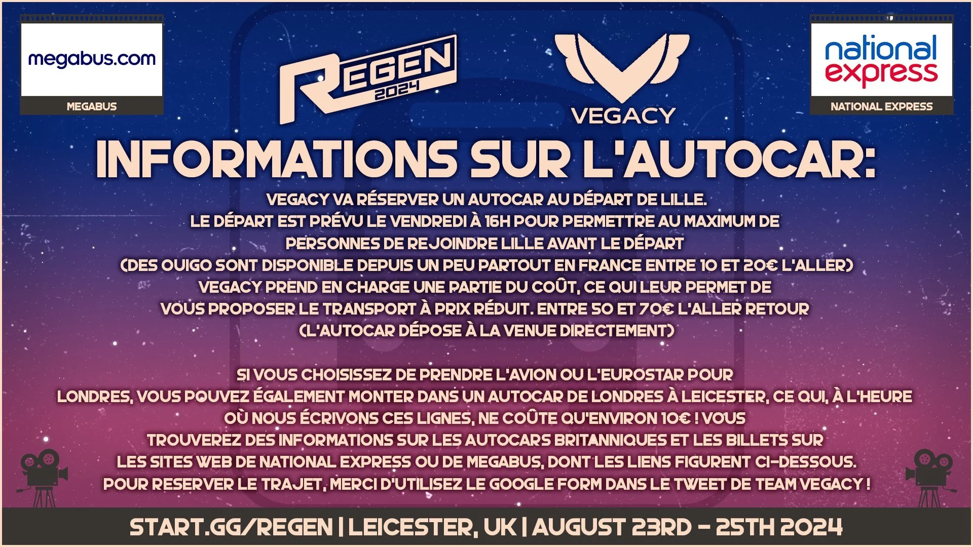
While the majority of Team Regen’s event attendance is comprised of audiences within the UK, we recognised that the best way to expand our brand would be to also target European audiences.
For this reason, we sought to reduce the burden of both potential and registered attendees having to research how to travel to / attend Regen 2024, we implemented travel guides, accommodation recommendations and additional helpful information into the event’s marketing campaign.
Travel guides were created for 9 countries including France, Spain and the USA, and were professionally translated into each country’s most spoken language when English wasn’t applicable. These guides included help on how to travel via flight, train, coach and car.
The travel guides & additional information were a substantial success, leading to over 100+ more foreign attendees registering for Regen 2024 than Regen 2023.
In total roughly 1/3 of Regen 2024’s attendees came from countries other than the United Kingdom, compared to Regen 2023’s foreign attendance rate which was roughly 2/13. It can be recognised that Regen 2024’s marketing campaign and its inclusion of travel guides has lead to an expansion of Team Regen’s brand into foreign markets.
Note: Travel guides + certain infographics were created before the event’s design brief was rebranded.
COMMENTATOR REVEALS
Commentators are an important aspect of a competition’s livestream; its often beneficial to promote their attendance.
To improve workflow efficiency in creating reveals for Regen 2024’s selected 14 commentators, I created a single motion graphic template that could have the name and photo of each commentator easily substituted with no further editing required.
To lightly fit with the film motif of the marketing campaign, I put an emphasis on the inclusion of stars and film strip in the motion graphic to invoke imagery of movie stars on the ‘Hollywood Walk Of Fame’.
While each reveal was visually similar, we asked featured commentators to pick their favourite song to use as backing audio for when we posted versions to social media. Besides lightly individualising each reveal, it allowed us to present our featured commentators in a more personable manner to audiences even before the event took place.
Informative designs and posts were posted to Team Regen’s social medias.
This aided attendees while also providing additional resources for potential attendees to learn about Regen 2024.
While we didn’t expect informative designs alone would lead to audiences registering for the event, it could at the least inform them of any decisions they may make towards Regen 2024 (such as an attendee only buying a ‘Friday Day Pass’ as they only want to participate in the Pokémon tournament).

EVENT INFORMATION